All work
Foodstuffs Design System
Built and scaled a design system to support three supermarket brands
COMPANY
Foodstuffs
ROLE
Senior Product Designer
YEAR
2023 - 2025
TYPE
Design System · Grocery eCommerce
Overview
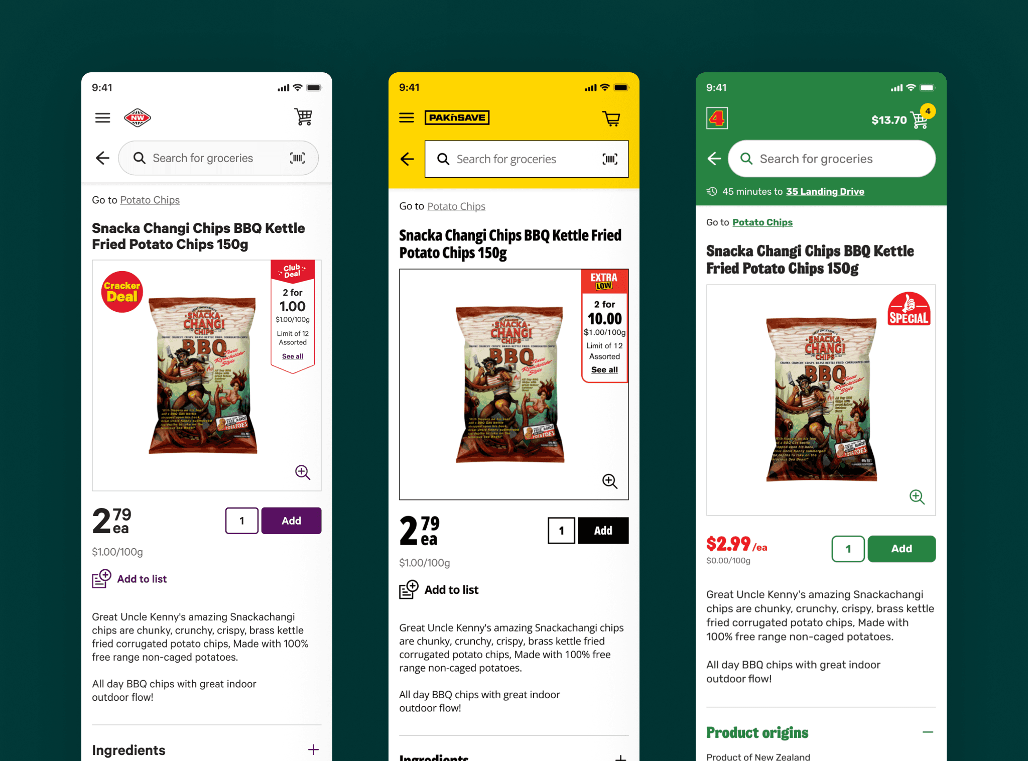
Foodstuffs operates multiple supermarket brands across New Zealand, each with its own market position and personality. As these brands, New World, PAK'nSAVE and Four Square, expanded their eCommerce offerings and introduced new digital features, inconsistencies began to emerge across design and development.
Designers were creating new text styles and colour variations that closely resembled existing ones, while similar components were being built multiple times. This duplication made the digital experience harder to maintain and slowed down the process of designing and building new features.
I was responsible for establishing a design system that would bring consistency to the organisation's digital experiences while preserving the unique identity of each supermarket brand.
The challenge
How might we create a shared design system that improves consistency and efficiency while allowing each brand to retain its distinct personality?
There were three key challenges to address:
Consistency
Reduce duplication and prevent the creation of near-identical styles and components.
Scalability
Establish a structure that could accommodate additional brands.
Adoption
Make the system intuitive and practical for a small team that was relatively new to design systems.
A fully themed component library was one possible solution, but it risked introducing unnecessary complexity and compromising the individuality of existing brand experiences. I needed to find a balance between shared foundations and brand-specific expression.
My approach
1. Establishing the structure
I began with New World as the first brand in the system, designing the underlying structure to support additional brands in the future.
Working with developers, product and project managers, and fellow designers, I facilitated workshops to align on how the system should be organised and maintained. We used atomic design as a starting point, adapting the approach to suit our team's needs and the complexity of our digital products.
Together, we defined four distinct layers:
Foundations
The core visual building blocks of the system, including colour, typography, icons and spacing. These provide a consistent starting point for design across platforms.
Components
Reusable interface elements built from the foundations, such as buttons, selects and input fields.
Patterns
Combinations of components that form larger, repeatable interface structures and layouts, helping teams create consistent experiences more efficiently.
Snowflakes
Unique experiences designed for specific use cases or business logic. Rather than forcing every solution into the core system, these could live within the application layer where appropriate.
This structure gave the team a shared language for discussing, creating and maintaining design assets, while allowing flexibility for experiences that didn't fit a standard pattern.
2. Balancing shared foundations with brand individuality
One of my key architectural decisions was to separate the shared foundations from the brand-specific components.
I chose to create a common layer of themed design tokens and text styles, while maintaining separate component libraries for each brand.
This approach addressed two competing needs: consistency across the organisation and the freedom for individual brands to express their market position.
A fully themed component system could have reduced duplication further, but it would also have required redesigning existing components, such as buttons, to work across every brand. For our small team, the additional complexity wasn't justified by the benefits.
3. Creating scalable tokens
To make the foundations flexible and maintainable, I established two levels of design tokens: global (primitive) tokens and semantic (alias) tokens.
Global tokens defined the underlying values, such as raw colours and numerical spacing values.
Semantic tokens described how those values should be used within the interface, connecting design decisions to their intended purpose.
This separation created a clear distinction between a value and its role in the experience. It also allowed us to manage the visual foundations without introducing a large number of component-specific tokens.
I developed a naming convention designed to be understandable for both designers and developers, with room to expand as the system grew.
For colour tokens, we used the structure:
color.property.modifier
Where modifier is one or many of: colour role, emphasis, state.
For numerical tokens, such as spacing, we used multiples of a consistent base unit.
spacing.8,spacing.16etc
After aligning on the approach with the team, I implemented the token structure in Figma.
The goal was to make the system predictable and easy to navigate, reducing ambiguity when selecting existing styles and making it easier to introduce new tokens when needed.

4. Rebuilding the component library
With the foundations and architecture established, I rebuilt the existing New World components in Figma using the new tokens and the agreed design system structure.
The separation between shared foundations and brand-specific components also meant that the system could evolve without forcing every brand into the same visual language.
As the project progressed, additional brands were incorporated as new pieces of work required them. This allowed the system to grow incrementally rather than requiring all brands to be in system from the outset.
5. Making the system usable through documentation
A design system is only useful if people can understand how and when to use it.
To support adoption beyond the Figma files, I created comprehensive documentation in Zeroheight. This gave the team a central place to understand the system's structure, foundations, components and intended usage.
6. Establishing governance and encouraging adoption
Creating a design system was only part of the challenge. To make it sustainable, we needed a shared understanding of how it should be used, maintained and improved.
I facilitated a workshop with the team to establish processes for managing changes to design system files and keeping the system aligned as our products evolved.
We introduced a peer review step to ensure new designs and components were connected to the existing system wherever possible. This helped prevent unnecessary duplication and the introduction of new colours or components when suitable alternatives already existed.
We also encouraged developers to flag instances where a design should be using an existing token but wasn't. This made consistency a collective responsibility across design and development.

The outcome
The design system grew from its initial implementation for New World to support three supermarket brands: New World, PAK'nSAVE and Four Square. This demonstrated that the underlying architecture could accommodate different brand identities without requiring a complete rebuild.
Key outcomes included:
Multi-brand scalability
Extended the system across New World, PAK'nSAVE and Four Square while allowing each brand to retain its distinct visual identity.
Greater design consistency
Established shared foundations and semantic tokens to reduce unnecessary variation in colour, typography and spacing.
Reduced duplication
Introduced peer review to prevent unnecessary new styles and components when suitable alternatives already existed.
Shared ownership
Established documentation and governance processes that encouraged designers and developers to take collective responsibility for maintaining consistency.
The impact extended beyond the Figma library. By combining a flexible architecture with practical review processes and shared team ownership, we created a system that could evolve while helping prevent tech-debt.
Reflection
This project reinforced that a design system is as much about people and processes as it is about design assets.
The architecture needed to balance consistency with brand individuality, but its long-term effectiveness depended on making the system easy to understand, practical to use and straightforward to maintain.
My key learning was that a successful design system doesn't just provide reusable building blocks; it creates a shared way of working that helps teams make consistent decisions.

